
The winds of change of a new season have passed over us, resulting in new team kits for 2023.
Some are familiar, borderline timeless at this point, while others are trying to disrupt and break new sartorial ground with new colours and designs. The branding of the big sponsors will still be filling our screens for the year, but in new and exciting (and sometimes hideous) colour combinations.
Because we're deeply democratic here at Cyclingnews, all of our writers have marked each kit out of 10, with an aggregate score making up what we are once again terming the 'definitive' ranking.
I'll be passing judgement over each kit (and my colleagues' wisdom) but to make things more interesting I also asked my mother to weigh in. She makes her own clothes and isn't scared to speak her mind.
We start from the bottom and work up towards to the team voted to be the best.
Feel free to react in the comments section below, if you think we've all got it totally wrong.
30. Jayco AlUla (Men)

This wins my award for "kit that most resembles a haemorrhoid cream".
The colours and fonts just put me in mind of a pharmacy. Not the fun bit with the hair gel, nor the prescription-only bit, but the bit in between that takes care of those conditions that are embarrassing, but not so much so that you get the privacy of the little paper bag. You have to go up to the till and let everyone else in the queue know you have athlete's foot.
Will's Mum says: That is a cheap blue, isn't it? There are so many beautiful blues, and that's not one of them.
29. Jayco AlUla (Women)

It's moderately better than the men's by virtue of it being a better, darker main blue, but it's still giving me pharmaceutical vibes and suffers the same problems for it. I don't like it, and it deserves to be near the bottom of the bunch.
Will's Mum says: [Refer to what she said about the men's team]
28. Team DSM

It's not often I agree with my Mother, but I think she's got this one bang on. It does look like a football kit to me. Dynamo DSM? It's also a little too plain, and the general theme (minus the sponsor decals) is very similar to vintage Team Sky. The colours aren't bad, but if you're going to make it look like a football kit then go all in like 2015 MTN-Qhubeka. That was a great kit, and it was a joy to watch Alan Shearer a.k.a. Steve Cummings pick up a stage at the Tour de France on Mandela Day.
Will's Mum says: Oh god that looks like something you'd see on a Saturday morning in the football.
27. Fenix-Deceuninck

I can only assume the team principle got a quote back for printing the final kit that was a little higher than expected and said something like "what if we just used the first draft instead" Yeah, the one with only two colours." Unless you're Greek and with extremely poor eyesight it's not going to set your heart aflutter.
Will's Mum says: Would you be proud to put that on? I wouldn't be proud to put that on. Nobody's given that any thought at all!
26. Liv Racing-TeqFind

I can see what they're trying to do but I don't think it's come off, sadly. A photorealistic flower on the shoulder could well work, but the colours are too dark and it kind of looks like a bad tie-die experiment. There isn't enough contrast, and again it falls victim to the abstract-but-not-enough trap that's befallen so many other kits this season.
Will's Mum says: They've put a flower on the shoulder and I quite like that. I'd actually wear that.
25. Intermarché-Circus-Wanty

This is it. This is the best kit in the World Tour. It's got everything a euro-fan could wish for - day-glo masterpiece of sponsor-soup. I can smell the frites from here, I can hear the terrible techno. Even the sponsors themselves are on point: Gambling, groceries, and building supplies. It's perfect. Yes, it looks terrible, but it's because of that that it's so perfect. Give it five years when it's OK to wear one yourself and they'll be the coolest one of the bunch, trust me.
Will's Mum says: Oh come on, that's terrible. It just looks cheap. It's ghastly. Oh God, just no. No. [Despite this damning verdict she still gave them three points]
24. Arkéa-Samsic

It's quite an achievement to create a colour that clashes with absolutely everything, but no matter which team Bianchi sponsors over the years the trademark celeste manages to bring down the overall look to something between jarring and awful. Here it's no different. The kit is inoffensive enough, if a little dull, but throw some off-green at it and throws the whole look off.
Will's Mum says: They've got nice green armbands that match the bike. I'm going to give them a six for green armbands because someone's thought about the bike.
23. Alpecin-Deceuninck

While my Mother thinks it's boring, I'm a big fan. Simple blue fade, prominent main sponsor, all the other sponsors in white. Classic and unfussy, without being so plain as Fenix-Deceuninck (though just as difficult to spell in a hurry). I am slightly biased as a massive cyclocross fan, so I get to stare at this one year round and have become rather fond of it.
Will's Mum says: It's boring.
22. Israel-Premier Tech-Roland

Not a fantastic start to the season for the Nation-Packaging Machinery-Muesli Bar squad. Personally I find it pretty inoffensive. They've tried to ape the popularity of the abstract jerseys of SD Worx et al but it falls a little short, partially thanks to a not terribly exciting colour palette.
Their biggest mistake was getting sponsored by Roland, manufacturer or both sweet and savoury snacks, rather than Roland, manufacturer of era-defining drum machines like the 808. That would have opened up the possibility of a killer hip-hop style kit, ideally with an Adidas collaboration (that's a joke for fans of Run-DMC).
Will's Mum says: Nobody's thought about where to put things. It's a bit boring.
21. UAE Team Emirates
Honestly, I love this kit. A simple monochrome design, nice symmetry, a colour palette that brings a bit of variety without being overwhelming. A blue bird of prey in a square logo though? A brave choice given the chequered history of the sport. Still, all in all a classy outfit, and one that I think will stand the test of time and be remembered fondly for its simplicity.
Will's Mum says: It looks like a football shirt. I've no desire to be footballer-y, have you?
20. Trek-Segafredo (men)
The mullet of the 2023 kit cohort: Business in the front, party in the back. The only problem is that it's a party I wish I hadn't been invited to and am desperately looking for an excuse so I can get out of going. The front is great. Clean, simple, and classy. The rear looks like a poorly tuned CRT television.
Will's Mum says: See, I think the Segafredo logo is really rather lovely, but when you see the back... All this stuff here makes it overcomplicated again.
19. Astana Qazaqstan

Along with Movistar, I really respect the longevity of this kit. I'm even approaching liking it, but I think that may be something akin to Stockholm syndrome rather than any genuine fondness. There have certainly been worse Astana kits over the years, that's for sure, but I do kind of miss the good old days of matching blue shorts. Most kits nowadays are rather corporate looking, and nobody dares to go for the full set anymore. Dare to be different next year, Astana,
Will's Mum says: They're going to have to get a grip, these guys. It is quite smart, and you can see who the sponsors are, but they could have done more with the shoulders.
18. Bahrain Victorious
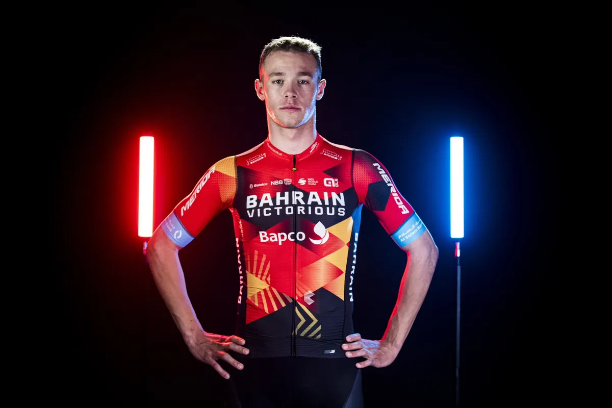
No real change for a team kit that tries to be abstract, but in a non-committal way. I can see what the designers wanted to do with the motifs, but I wish they'd been allowed to go wild with it (and ditch the blue armbands). I can't find any design notes online, but it's giving 'desert sunset', so go all in. More chevrons, more sunbeams, give me a dune, make the blue an oasis.
Will's Mum says: Oh it's dreadful, absolutely dreadful. It's overcomplicated, and if you're a commentator seeing that coming towards you... just no.
17. Soudal-QuickStep

Finally the worlds of flooring and adhesives have combined and Julian Alaphilippe can stick down those oak effect floorboards he's had in his shed since 2014 without fear of being sponsor incorrect. I like this kit, it's too low down in the rankings and is at least top ten. It's a bit busy, but it's getting back to classic euro kits with a mishmash of sponsors everywhere.
Will's Mum says: It's quite a nice petrol blue, and they've got lobsters* on them. Looks quite nice on the road.
*My Mother refers to the Castelli scorpion as 'the lobster', and you should too.
16. Trek-Segafredo (women)
What's that...? Just make the men's kit blue...? But, everything else the same, yeah? Cool, cool. Sarcasm aside it's the same kit with the same issues as the men's version, only blue. Lovely front, busy back that spoils things.
Will's Mum says: [See what she said about the men's kit]
15. Uno-X

Good kit, good colours, bold sponsors, coherent design. It's a decent dark yellow, the red isn't too 'merry christmas'. The national champs bands on Hannah Barnes arms, too, are given appropriate prominence, which you don't always see with some kits. I'm not a massive fan of the helmets, as that gets a little too matchy matchy; they should be either yellow or red, but as a whole package on the red team bikes it's a good look, and deserving of its placing.
Will's Mum says: That is a nice shirt actually. If you have 'UNO' on one side and 'X' on the other it's not a good placement of sponsorship, but the colours are nice. A man has thought of that.
14. Ineos Grenadiers
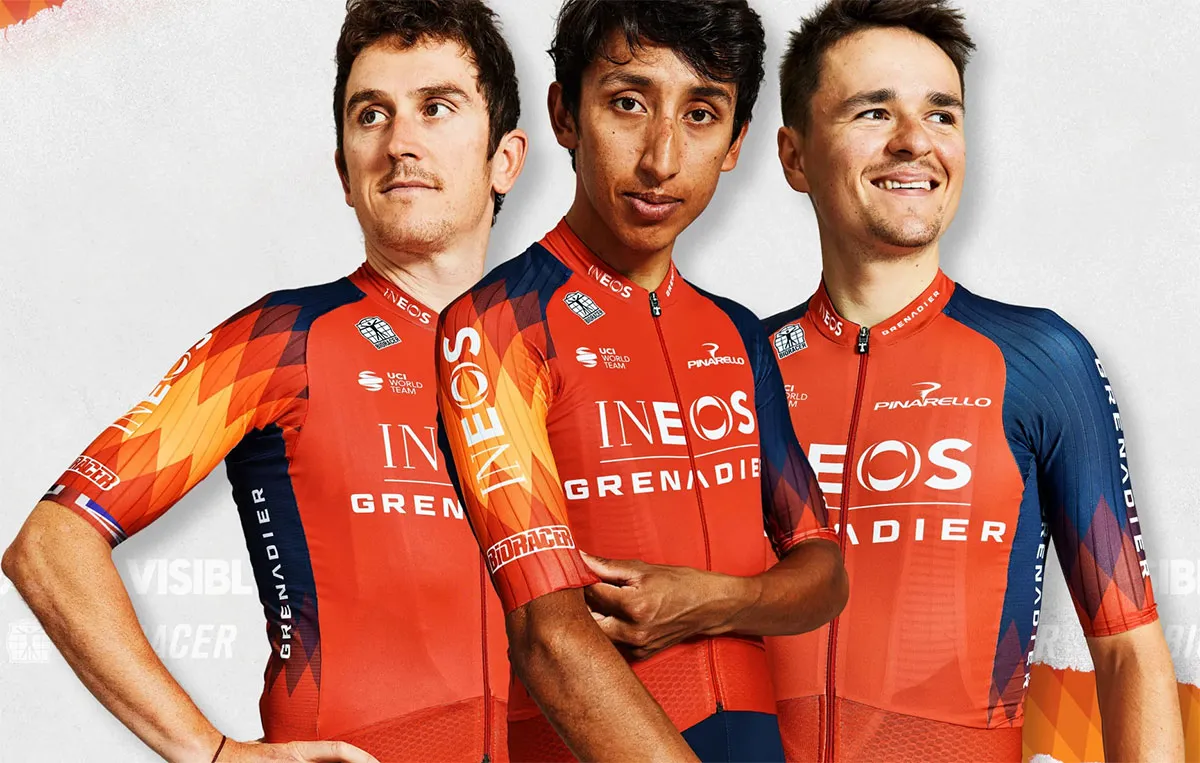
I'm not sure how they've got away with the most blatant copying of homework since I left school, but we are where we are. To their credit, Ineos have improved on the Bahrain design by moving the diamonds to the sleeves. That should be just enough to keep the lawyers busy. I like it, but Ineos, as per Team Sky, should be in all black. I'm not saying they lost their way as a team when they ditched the monochrome... Actually, I am. That's why they haven't won the Tour in a while.
Will's Mum says: It's not bad actually. Somebody has thought about that. I like the zig-zag sleeves.
13. AG2R Citroën Team

The Marmite of the pro team kits; you either love the brown shorts or you hate them. Personally, I love them. The simple block colours are classy, whatever your opinions on brown, and the red Citroën really pops against the brown jersey text. Even the font they've picked is excellent. Add in some subtle white logos on the shorts, and a classy bike scheme too and it's a winning recipe in my eyes. Long live brown shorts.
Will's Mum says: I'm a big fan of brown. Also, nobody else has brown and they've been consistent and you can see exactly who the sponsors; classy.
12. Jumbo-Visma

Again, this has been ranked too low by my colleagues. It's bold, easy to identify, and the colours don't clash. I'm a big fan of bees too, which helps. It's got the best design continuity of any package across bikes, kit and clothing. Wout van Aert also has fantastic hair, and I know that's not part of the kit but I don't care. This is a dictatorship, remember? Get everyone in matching yellow Oakley Sutros and it's even better (C'mon, Primoz, play the game!).
Will's Mum says: Ooh, now that's better; good sponsorship things. It's very distinctive, except that yellow... it's just not mustard is it? It's not custard, it's just a bit... Again, why can't people use expensive looking colours?
11. Human Powered Health

What is this, Team Zwift? Apparently it's an "angular, path-driven geometric pattern that the team says represents planning and growth toward better living". It's not. It's a big squiggle, or a very minimalist drawing of someone riding a bicycle. It needs more sponsors too; there's too much dead space that, in my eyes, should be filled with the logos of casinos and mayonnaise brands. This is cycling, after all.
Will's Mum says: It's quite catchy, but does it scream Human Powered Health to me?*
*I'm not quite sure Mum understands that the team is sponsored by a brand rather than an abstract concept.
10. Movistar

A perennial classic, and one that's hard to object to. It's a smart blue, and the fades to the neck and sleeve cuffs are subtle enough to not detract from the overall package. In all honesty I think if it wasn't such an established kit I'd be less fond of it, but I'm human and I am allowed my contradictory opinions, because on the face of it it's very similar to the Human Powered Health kit, but blue.
Will's Mum says: Well, they've got to have the 'M'. It's a clear uncomplicated kit.
9. Cofidis
A kit fit for a team of vampires. That's blood all down the front, yeah? Niche meme references aside I really like this kit. Simple, bold, easy to spot and nice colours. Asymmetrical without looking lopsided on the front, and the back, which is what we'll see most of, is a lovely piece of logo placement. This is one of my favourites.
Will's Mum says: I like Cofidis. I thought that was really classy. That is a really, really nice kit. That is really nice. Show me the back... because when you're on the bike, bent over... That's really nice. That's brilliant. You can see who your sponsor is. Lovely colour red.
8. EF Education-EasyPost

Of the two EF kits - men's and women's - this deservedly comes off second best. It's less visually interesting, and dare I say it a little less daring, especially compared to EF kits of the past. It's giving 'highlighter that's nearly out of ink'. It's not terrible by any stretch, and it's certainly one of the better kits in the men's WorldTour, but it could do with taking some design notes from the women's kit.
Will's Mum says: Oh god, they look like lobsters! There's pink and pink, and that's the wrong pink.
7. Bora-Hansgrohe
It's a good colour scheme that touches on Christmas elf. The front is a little busy for my tastes, but everything flows pretty well. It's inoffensive, save for one detail. Between the shoulders it says "Band of Brothers" and "No off season". This gets under my skin in much the same way as the 'Wolfpack' identity of the Quickstep squad; You're riding bikes, lads, not storming Omaha Beach.
Will's Mum says: Symmetry is everything, and if someone is going to make all that effort and it not be symmetrical? Also it should be 'Brora'*
*Brora is one of mum's favourite knitwear and wool companies.
6. EF-Tibco-SVB
Personally I think this is the nicer of the two EF kits, and a real masterclass both in intelligent sponsor placement, and how to do a minimalist colour scheme without being dull. Not having sponsors on the stomach makes sense, as when the riders are in an aero position (i.e. all the time) you can't see them anyway, so why not make the back the main event. The long sleeves of the Rapha Crit Jersey also add to a very modern looking package. One of my favourites.
Will's Mum says: They get an extra point over the men's version because they haven't got 'EF' written on the front.
5. FDJ-Suez
Another beautifully simple kit, showing that a decent colour scheme trumps a complicated design most of the time. The red shoulder is a great bit of contrast; asymmetry without unbalancing, and it's a good red too. The fade to black so it blends into the shorts I'm not totally sold on, but it's not offensive either, I'd just rather have a distinct jersey and shorts separates package, or a full matching coloured shorts getup. All in all though, very lovely.
Will's Mum says: I'm not a fan of Suez*. They have got a nice red thing going on though, so they get points on account of that and the gradations.
*Suez are our local recycling provider, so if they want a better score for their cycling kit from my Mother they need to get better at accepting the fact that sometimes white paper slips into the brown paper and cardboard bag.
4. UAE Team ADQ
Ah I like it. It's got qualities like FDJ-Suez in that it's simple, with a decent colour scheme, and it's bold enough like that of SD Worx without going mad or adding a tummy star. It's a wee bit pastel for my tastes though, but I'm glad they just stuck with a simple colour fade and not gone for any additional business.
Will's Mum says: No I don't like that at all. It just looks cheap.
3. SD Worx
Another example of an abstract kit that's better for actually committing to being abstract. Great, vibrant colours, easily identifiable. I'm not totally sure what the odd star on the tummy is about though, so they definitely get points knocked off for that as it detracts from the overall design. I'd wear it though, and think it deserves to be placed higher.
Will's Mum says: Ooh, now that's nice! That's really nice. Get rid of the star on the tummy though. I think that's really quite cute.
2. Canyon-Sram
Now that's how you do abstract! I love it. I'd have loved to have been in the design meeting. "What if we stuck some diamonds on the shoulders?" Sure, go for it. "Can we put the shipping forecast on it too?" Absolutely! Good colours, mad design that translates across everything from the helmet, through the bikes, to the team car and makes them all look the better for it. Honestly, if it had matching shorts... no, maybe that would be too much?
Will's Mum says: Oh dear God... Oh dear God... Are you sure? Well, hang on a minute. It's growing on me. Wait a minute. It's different. I quite like that. I like the shoulders.
1. Groupama-FDJ
A symphony in red, white, and mostly blue. You can't really go wrong with navy blue, it's always a smart looking base, and the wee pops of colour here and there help elevate it away from being boring. My favourite touch is how the red and white central stripe occasionally lies next to just-the-right blue to suggest it's the French team in the peloton. Deserved winners.
Will's Mum says: OK. I'd be more proud to put that one on. I liked the detail in the zip going down the red. The red is classy. That's nice.

Thank you for reading 5 articles in the past 30 days*
Join now for unlimited access
Enjoy your first month for just £1 / $1 / €1
*Read any 5 articles for free in each 30-day period, this automatically resets
After your trial you will be billed £4.99 $7.99 €5.99 per month, cancel anytime. Or sign up for one year for just £49 $79 €59

Join now for unlimited access
Try your first month for just £1 / $1 / €1


